Nye Rees
Brief
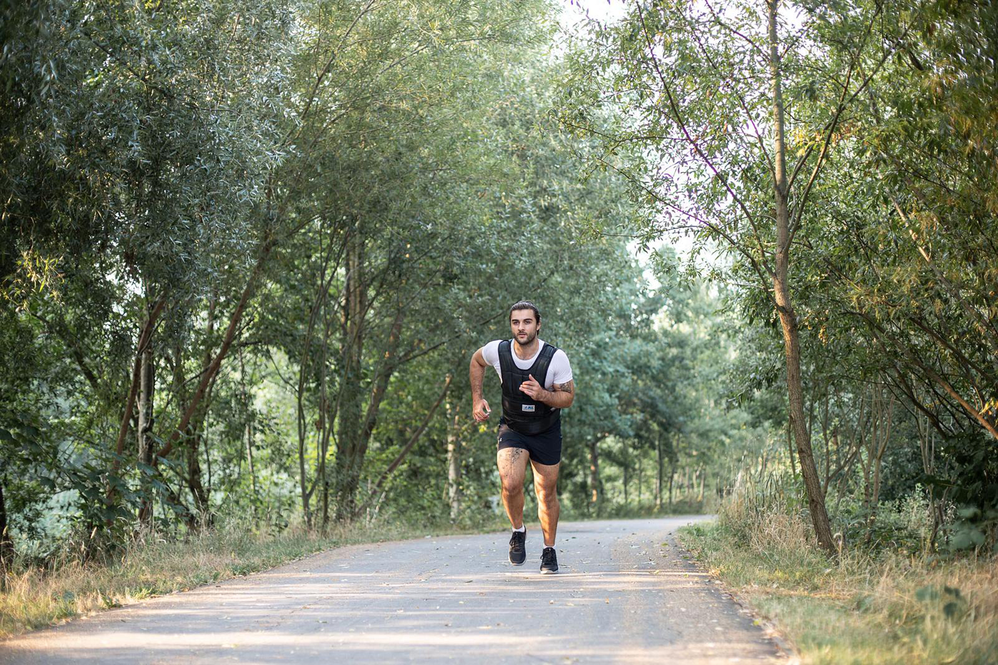
A brand and portfolio website for an up-and-coming personal trainer. Nye was taking the step from working for exclusive gyms to having his own clients, and wanted the opportunity to present his holistic approach to personal training.
Research
We embarked on a really lively brand workshop process (remotely of course, mid-lockdown) that started conversations around key themes and tone of voice.
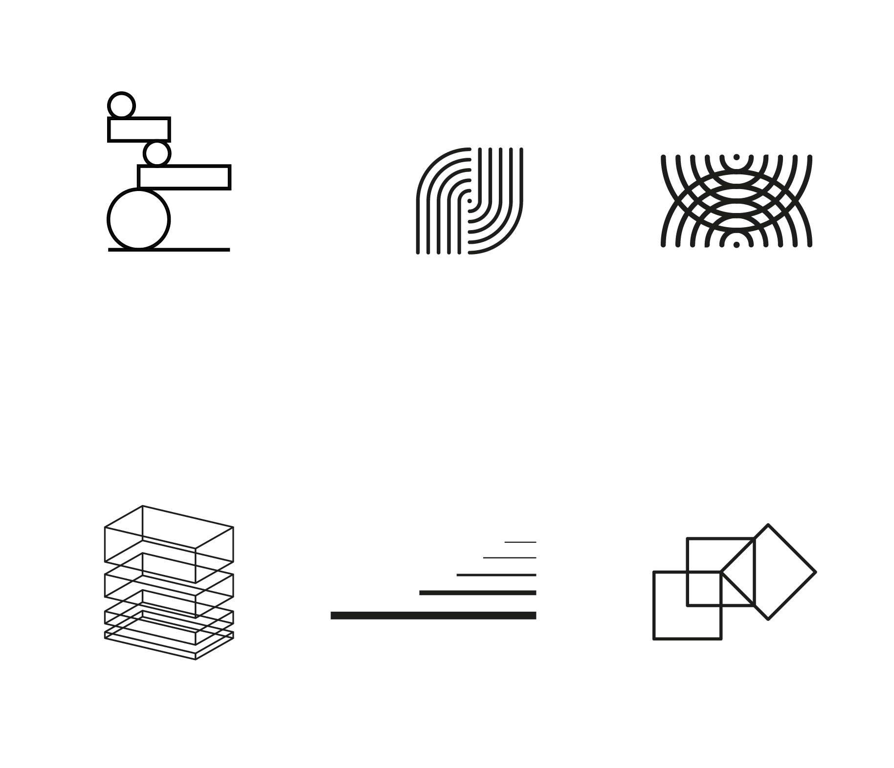
I’m a big fan of this part of a branding project, it’s always so interesting to see what comes up. We landed on three personality traits to explore; balance, partnership and progress. Having unpacked the personality of the brand like this, I was then able to create fairly abstract graphic approaches to challenge Nye aesthetically.
Development
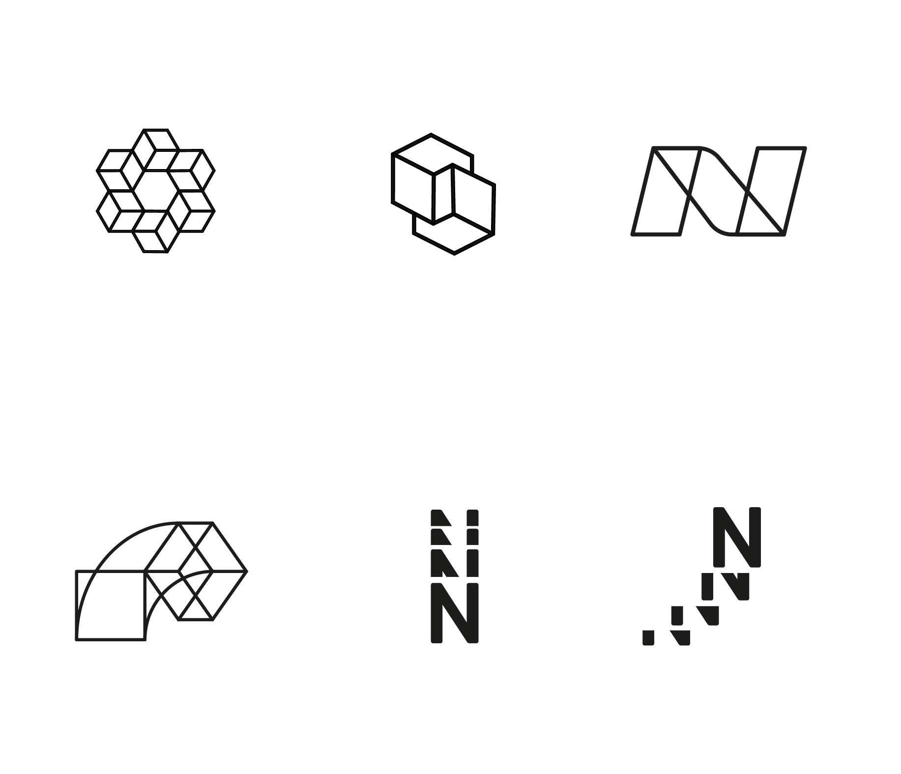
With these visual explorations as a starting point, we honed in on which were best reflecting Nye’s vision for the business. From there we kept checking back against the three key personality traits until we had a clear winner.
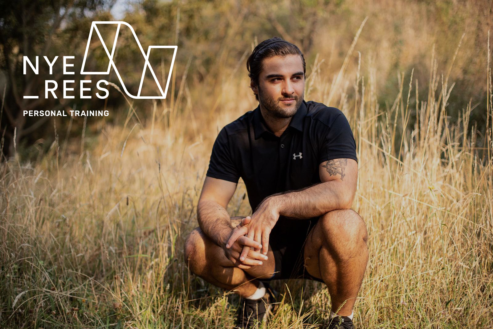
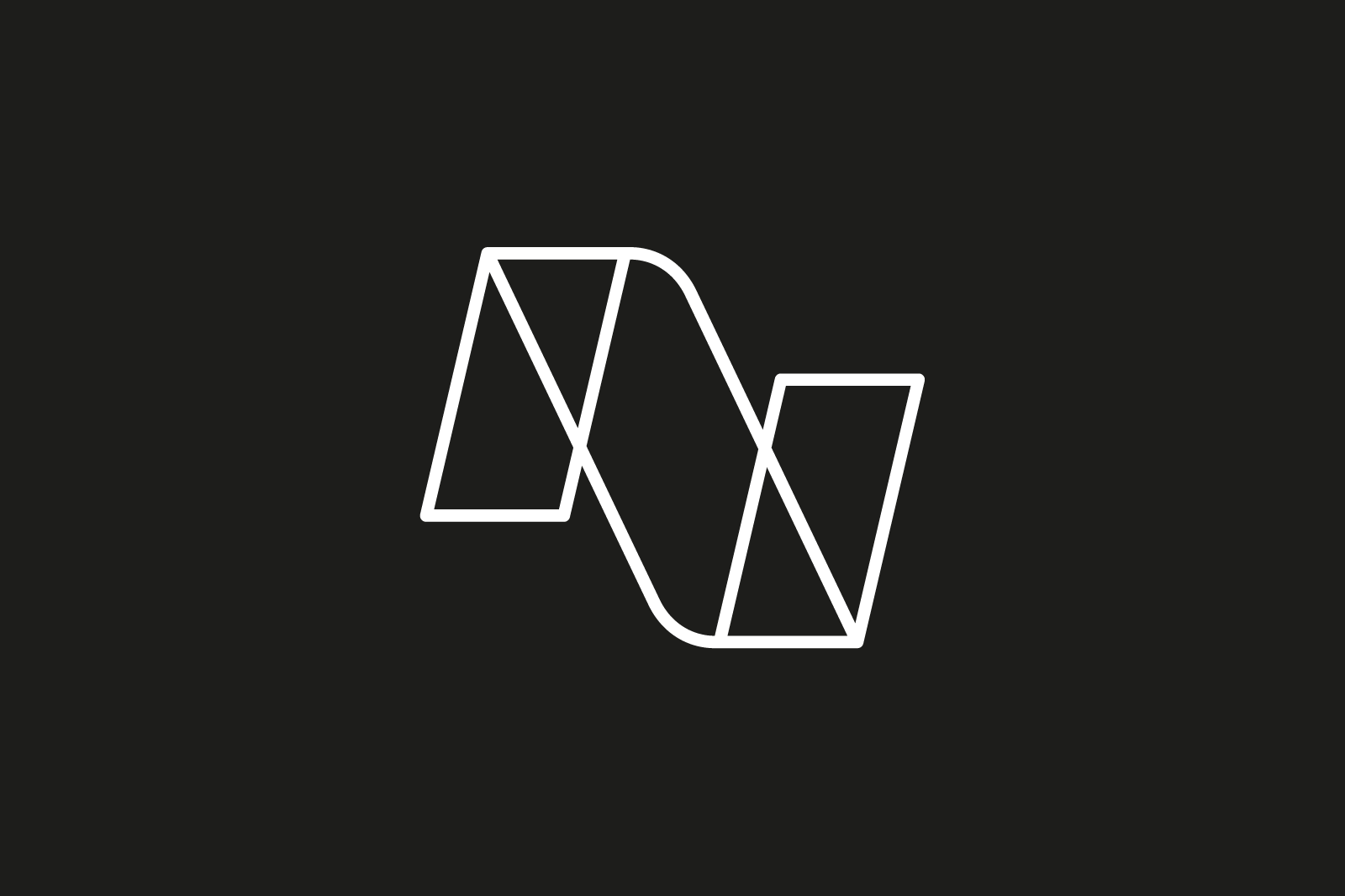
We then wanted to build in flexibility so Nye could confidently use his logomark across social media posts, ontop of photos, on business cards and on the website. We decided on a suite of marks that meant he could use just the graphic, or with and without a strapline for different contexts.
Outcome
The logomark is modern and somewhat masculine and allows Nye to create brand recognition across his channels. The website is minimal allowing for photography of Nye training to shine.
When the time is right, I’d love to work up some graphic elements that draw from the mark, particularly those upward diagonal shapes. I can see them animated too – bouncing dynamically, or whooshing in from off screen…
